

As we all know that a Chart is a graphical representation of data. Charts help us to visualize the data in graphical form and can display a lot more information in an easy to understand visual format. Most of the time it is difficult to draw a conclusion just by looking at the data we have, and this is where charts become handy and can be used to convey information.
Charts are easy to insert based on the source data manually but sometimes we need to automate the chart insertion and most people find it difficult to control the chart creation and its properties via VBA. In this article, I will show how you can use VBA to insert a Chart, as well as manage its appearance.
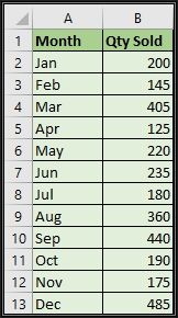
We will start by creating a simple Clustered Column Chart based on the simple Monthly Sales Data as shown below. You can download the file by clicking the link at the bottom of this article.
This is a simple month wise sales data…
Inserting Chart Manually:
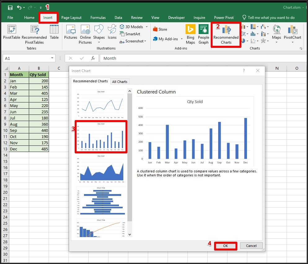
First, we will go through the process to manually insert a Clustered Column Chart. To do so, follow the steps given below…
- Click inside the data.
- Go to Insert Tab.
- Under Charts Section, click on Recommended Charts.
- Excel is smart enough to suggest you the most obvious charts depending your data, click on Clustered Column Chart and click on OK to finish.
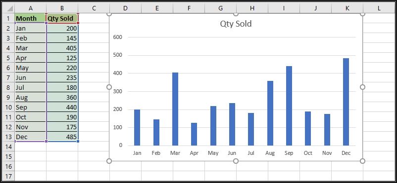
The above method will insert a Clustered Column Chart on the Sheet. You can resize and move the chart by simply selecting and dragging it to the desired location on the Sheet.
To follow the above steps, you can take the help of the following image…
Tip: While resizing the chart, hold down the Alt key and when you resize the chart, it will automatically fit along with the cell boundaries.
The final Clustered Column Chart inserted with the help of the above method will look like the image shown below...
Brief introduction of Chart Elements:
Now it’s time to learn how can we insert the same Clustered Column Chart programmatically with the help of a VBA code.
But before actually going for that, we must be familiar with the chart elements we will manipulate through the VBA code and these are shown below…
- Chart Area: This is known as the entire chart or the chart container.
- Plot Area: This is the area where Excel plots your data.
- Axes: Normally a chart has two axes i.e. a horizontal axis also known as X-Axis and a vertical axis also known as Y-Axis.
- Chart Title: It is a TextBox with a Text which is a textual description of the entire chart.
- Data Series: All the data points in the same type of data of a single column or a row.
- Data Point: A single numeric value of a data series e.g. a single column in a clustered column chart.
- Legend: Legends in a chart are used to distinguish between different data series on the chart.
Inserting a chart with VBA:
After a short description of important chart elements, let us continue to write a code which will insert a clustered column chart based on the sample sales data.
To do so, either download the Workbook from the link at the bottom of this article or open a new blank Workbook and enter the sales data on Sheet1 manually.
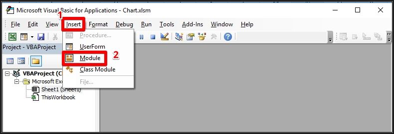
Assuming you have placed the sales data on Sheet1, press Alt + F11 to open Visual Basic Editor. On VB Editor (Visual Basic Editor), click on Insert and choose Module. This will insert a New Module in the VB Project as shown below…
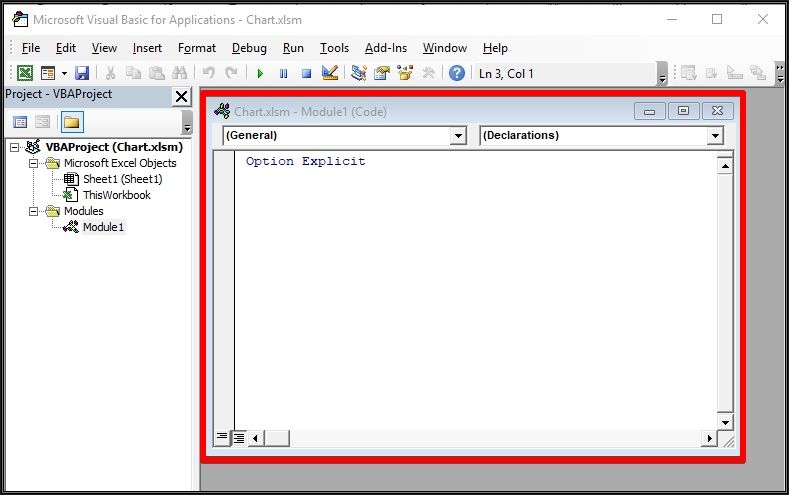
Now place the code given below into the newly inserted module called Module1.
Sub InsertChart()
'Declare all the required variables here
Dim wsData As Worksheet    'Sheet variable to hold the reference of Sheet with Source Data
Dim chObj As ChartObject   'Chart Object variable
Dim SourceData As Range
Dim cLeft, cTop, cWidth, cHeight


Application.ScreenUpdating = False


Set wsData = Sheets("Sheet1")
Set SourceData = wsData.Range("A1").CurrentRegion


'setting the dimension and position of the chart
'cLeft and cTop will help to align the chart to the top left of the cell D1
cLeft = wsData.Range("D1").Left
cTop = wsData.Range("D1").Top


'cWidth and cHeight will help to set the width and height of the chart
cWidth = 500
cHeight = 300


'Deleting any existing chart on wsData Sheet before inserting a New Chart
On Error Resume Next
wsData.ChartObjects.Delete
On Error GoTo 0


'Inserting the default Clustered Column Chart and setting the source data for the chart
Set chObj = wsData.ChartObjects.Add(cLeft, cTop, cWidth, cHeight)
chObj.Chart.SetSourceData SourceData
Application.ScreenUpdating = True
End Sub
The above code is all if you need to insert the default Clustered Column Chart Type with default Chart Elements such as Chart Title and Legends added onto it. But most of the times we need to format the Chart or add/delete some Chart Elements on it.
Let’s now talk about how we can add code to format the Chart and add/delete some of the Chart Elements in our main code.
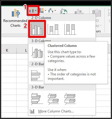
Controlling the Chart Type:
When you insert a basic chart with the help of the code given above, a default Clustered Column Chart is inserted. But you can control which type of Chart you want to insert and some of the examples are given below…
'Clustered Column Chart
chObj.Chart.ChartType = xlColumnClustered


'Pie Chart
chObj.Chart.ChartType = xlPie


'Bar Chart
chObj.Chart.ChartType = xlBarClustered


'Line Chart
chObj.Chart.ChartType = xlLine


'Line Chart with Markers
chObj.Chart.ChartType = xlLineMarkers


In the same way, you can insert other types of charts as well.
Controlling Data Labels:
When you programmatically insert a Chart, the DataLabels are not shown on the Chart but you can show or hide the Data Labels and also set the position of the DataLabels as you're your requirement using the following lines of code…
'Displaying the data labels
chObj.Chart.SetElement msoElementDataLabelTop


'You can set the position of the data labels as per your requrement e.g.
chObj.Chart.SetElement msoElementDataLabelBottom


'If you want to hide the data lebels
chObj.Chart.SetElement msoElementDataLabelNone
Setting the Chart Title:
Though the Chart Title will be automatically be added when you programmatically insert a Chart, you can also explicitly add the Chart Title and set it’s Text as per your requirement using the following lines of code…
'Enabling the Chart Title
chObj.Chart.HasTitle = True
chObj.Chart.ChartTitle.Text = "Quantity Sold By Month"
Setting the Legend:
You can also hide the Chart Legends and make them visible again if you want using the following lines of code…
'If you want to hide the Legends
chObj.Chart.SetElement msoElementLegendNone


'Show Legends on right side
chObj.Chart.SetElement msoElementLegendRight
Hide or Show the Chart Gridlines:
You can also hide the Chart Gridlines and make them visible again if you want using the following lines of the code…
'Delete the Gridlines
chObj.Chart.Axes(xlValue).MajorGridlines.Delete


'Show the Gridlines again
chObj.Chart.SetElement msoElementPrimaryValueGridLinesMajor
So, this was all about how you can programmatically insert a Chart in Excel and control its elements.
In the next part, we will discuss how we can format some other elements e.g. changing the color of the Chart Series, moving Chart from one Sheet to another Sheet etc.
Download File:
There are two modules called Module1 and Module2 where Module1 contains the code to insert a basic Clustered Column Chart and Module2 contains the complete code which you can customize as per your need by deleting the unwanted lines of code.
Have a question about something in this article? You can receive help directly from the article author. Sign up for a free trial to get started.
Comments (7)
Commented:
Commented:
Commented:
Commented:
Commented:
View More